
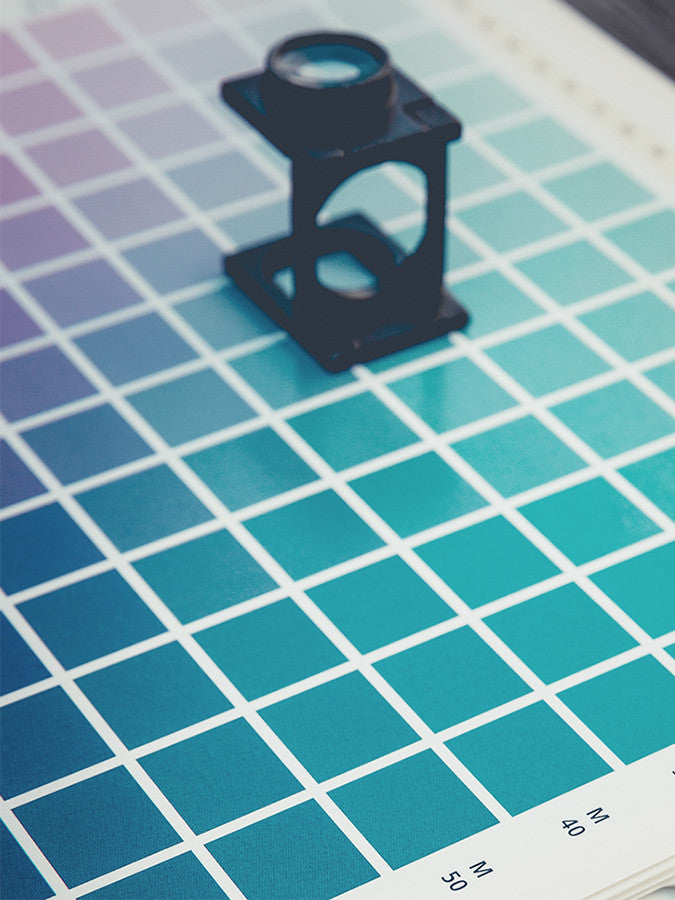
 One of the most important elements of design that can easily make or break a space is color. Carefully chosen color schemes have the amazing ability to convey a mood, create a pleasing environment, hide or accentuate architectural details, or completely alter the feel of a room with the change of a single hue. Color can be one of your greatest tools when designing your space if you know how to utilize it properly, but there are so many elements to think about when choosing a cohesive color scheme that it can get confusing. Arming yourself with the knowledge of various attributes of color, how to mix different colors properly, and the distinct effects that different colors can have on a space will help you develop a color scheme that will elevate your design, rather than distract from it.
Related Post: How To Add Color To A Neutral Kitchen
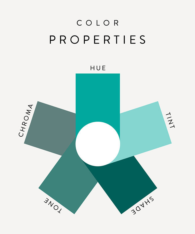
Color Properties
Once you move past your basic hues - red, orange, yellow, green, blue, violet, and any combination such as red-orange, yellow-green, and blue-violet - there are four main modifiers that can alter the value and intensity of these hues to bring you a wider range of colors.
Tint
A tint is a higher value of a color achieved by adding white to the basic hue. Adding white lightens the color without changing the hue. An example of this would be blush, mint, and peach, often referred to as light or pastel colors.
Shade
A shade is a lower value of a color achieved by adding black to the basic hue. Adding black to a color darkens it without changing the hue by absorbing more light. An example of this would be eggplant, evergreen, and burnt orange, shades are often referred to as deep or dark colors.
Tone
A tone is a color with any combination of white and black, or gray, added to it. Tones are described as softer versions of their basic hue, and are less saturated than their original color.
Chroma
Chroma, or saturation, refers to a color's intensity. Say we start with red, a primary color in its purest form. The hue cannot get any more saturated therefore this is the hue’s maximum chroma. By gradually adding the color directly opposite of red on the color wheel, or its complement (which is green in this case), we begin to reduce the saturation of the red hue. The more green we add the less saturated the red becomes, and once we have added equal parts green and red we arrive at a neutral gray, or chroma 1. Colors at maximum chroma are referred to as bright or highly saturated while colors at a lower chroma are described as dull or muted.
Color Schemes
A color scheme is simply an arrangement of harmonious colors, and there are several types of color schemes that you can use as a guideline when choosing colors for a room.
Monotone
A monotone color scheme is a mix of neutrals, which are hues of a very low saturation, or chroma, such as tan, gray, and charcoal. It is hard to go wrong with this safe color scheme, but it can also lack depth so special attention needs to be paid to other design elements in the room such as shape and texture.
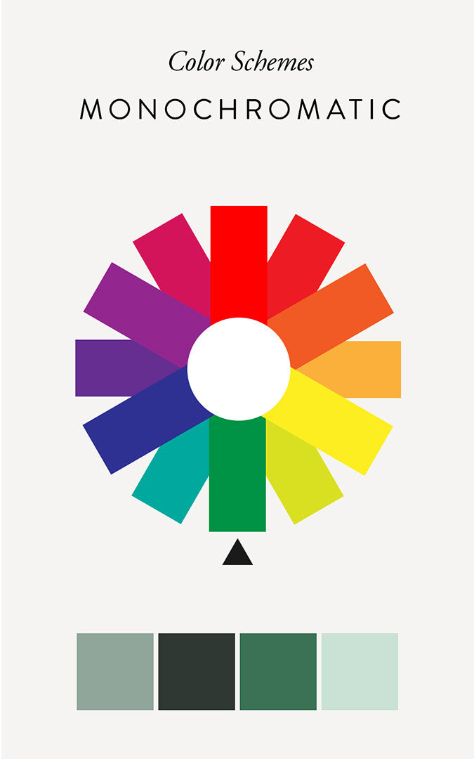
Monochromatic
A monochromatic color scheme consist of one hue in various saturations and values. This type of color scheme is also on the safe side, but the lack of diversity can be hard to live with.
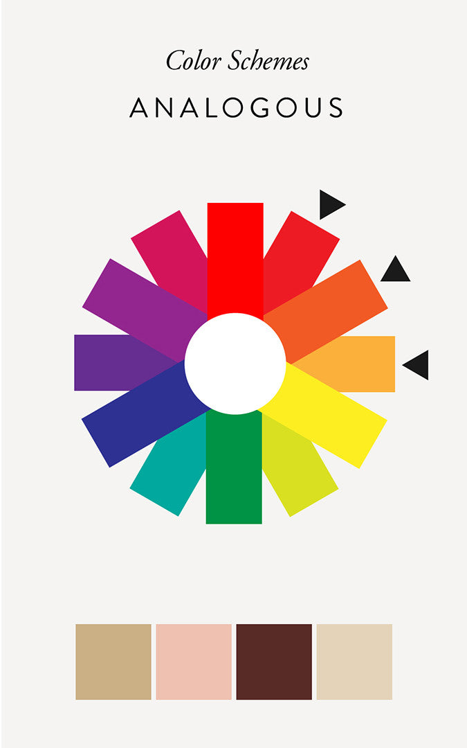
Analogous
An analogous color scheme consists of hues that are close to each other on the color wheel such as red, red-orange, and orange. Stick with colors from no more than ¼ of the color wheel to guarantee a harmonious combination.
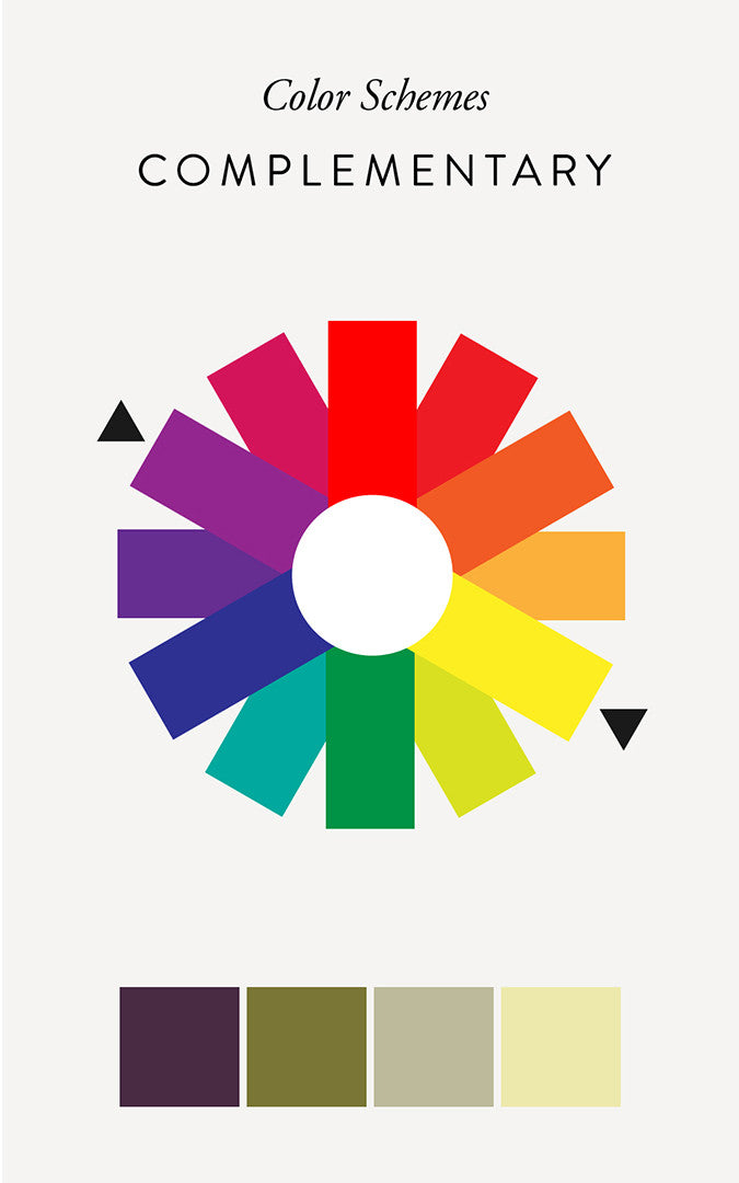
Complementary
A complementary color scheme consists of colors directly across from each other on the color wheel. This creates a pleasing balance in a space, but to keep this combination from looking too harsh stay away from highly saturated colors.
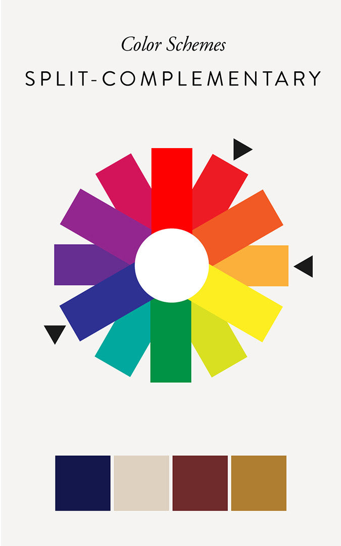
Split-Complementary
This variation of a complementary color scheme uses a hue from one side of the color wheel combined with two hues on either side of its direct complement, such as blue, red-orange, and yellow-orange. This color scheme is more diverse than the simple complementary color scheme.
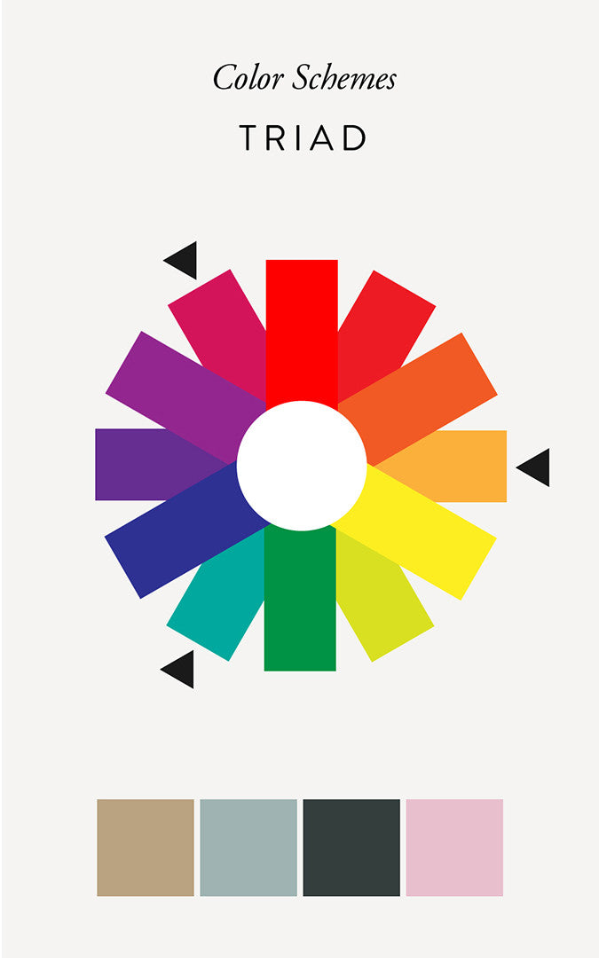
Triad
A triad color scheme incorporates three hues roughly equidistant from each other on the color wheel, such as orange, green, and violet. When adding more colors to your scheme try lower saturations to keep the combination harmonious.
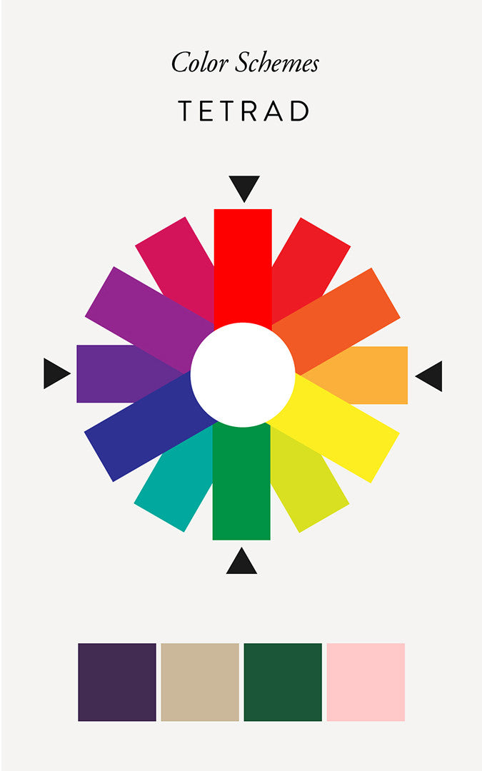
Tetrad
Tetrad color schemes use the most colors on the color wheel combining four colors of equal distance such as blue-violet, red, orange, and green. When used correctly this color scheme can be a lively combination, but follow the same rules as the triad color scheme to retain harmony.
Color Psychology
Different colors have a vastly different impacts on our emotions. Although there hasn't been a lot of research in this area, observations have been made regarding various colors and their effects on our moods.
Reds
Red is on the warm side of the color wheel, and causes excitement and stimulation. Reds are also associated with danger.
Oranges
Oranges have a warming, cozy effect, especially in lower chroma. Bright oranges are associated with caution.
Yellows
Yellows, while still on the warm side of the color wheel, convey less excitement and stimulation than reds and oranges, and more brightness and cheer.
Greens
It's no surprise that green, the color most commonly found in nature, evokes a calm and peaceful vibe.
Blues
Blues are seen as dignified and calming, although overuse of highly saturated blues can come across as gloomy.
Violets
Violets are a highly expressive color and the most problematic if not used correctly. Seen as artistic, violets can evoke dignity and royalty, but strong purples can create tension in a space.
Color Effects
Deciding on the most pleasing combination of colors for your space is only one part of choosing a color scheme. How the colors will interact with each other and your space is an equally important part of creating a cohesive design.
Effects of Color on Each Other
Our brains have the tendency to perceive colors differently based on the other hues that surround them. When set against a large background, a small amount of color may appear to change hue or value. For example, neutrals tend to take on the temperature of their surroundings, neutral gray surrounded by blue will take on a cooler hue, while neutral gray surrounded by red will seem warmer. A small amount of a light color will appear even lighter when surrounded by a dark color, and a dark color will appear darker when surrounded by a light color.
Effects of Color on Space and Objects
Different colors visually effect spaces differently. Light colors make a space feel larger, while dark colors make a space feel smaller and heavier. Warm colors tend to advance therefor appearing closer than they actually are. Cool colors on the other hand appear to recede and look further away than they actually are. You can use this knowledge to your advantage by tricking the eye. Have a small space that you want to feel more airy? Paint the walls a light blue so the space will feel larger and the walls will visually recede. Want to add a cozy feel to a large open room? A dark burgundy will cause the walls to appear closer making the space feel smaller and more inviting. (Take a look at these charcoal walls for some moody inspiration.)
The same can be said for furniture and accessories in a room. If you want a piece to stand out choose it in a color complementary to its background, if you want it to blend in choose it in a color analogous to its background.
Related Post: White Bathrooms
Effects of Light on Color
The temperature of ambient light in a space has a huge effect on the way we perceive color. Warm ambient light such as incandescent will make cool colors appear more neutral, and warm colors appear even warmer. Cool light such as fluorescents will make warm colors appear more neutral and cool colors even cooler. This is why it is important to choose color schemes in the same light that will be used in the space you are designing. The fluorescent lights used in most stores is not a good representation of how the color will look in your home, so be sure to take home swatches before you make your purchase.
Phew! That was a lot of info but I hope you gained some knowledge that will help you confidently choose the best color scheme for your space. Looking for some inspiration? Check out my color posts on the blog, and my color Pinterest board for some combinations to get you started. There are also some useful tools out there to help you choose a palette. Paletton is a great resource, and if you have Adobe Illustrator the Color Guide in the side toolbar shows preselected color palettes for any color you choose.

Subscribe to our newsletter: